Pre Production - Camera Test Shots Analysis Based on Research

One of the things I decided to do was some camera test shots of some of the locations I will be using during our shoot. I wasn't able to do all the locations due to unavailability and a sickness that had me in bed for almost 2 weeks, but I was happy because I did the most complicated ones. I will be working on the others, which are mainly kitchens, bedrooms and living rooms, but at the moment some of the most relevant ones got out of the way. I decided to pay a visit to the community hall, the nightclub and the football pitch, using the Sony EX and the Drone for it. This are some of the shots I took, based on Danny's direction and the shots he had given me on his shot list:


Pros and Cons about the Test Shots

The idea was that I could experiment on some of this locations and analyze what kind of problems I could face on the actual day of the shoot and if there were any problems that I could easily spot and how could I solve them. On the community hall I did find a couple issues with hopefully won't be much of a problem, but they are still there. First although it might sound irrelevant, the hall has 2 rooms, one of them which is where we are going to be filming and another one were the actual members of the club gather around to chat and drink. The problem is that the toilet is in our room and people have to go past it to get there, which means that there could potentially be some interruptions, but although finding a way around is more of a job for the producer or the director, I need to bare in mind that my job is to carry on filming wether someone is coming or not, unless the director tells me to stop. It could be that someone walks past and it actually looks good because it looks like an extra guest, but I have to keep in mind that is not my call to stop shooting. The other problem which I mentioned in a previous post regarding lighting, is that in the small room where Don talks to Dean and Ollie there is way too much light for what we need. There are two big lights in the room which both turn on and off together, which ruins it a bit because I wanted just half of the room illuminated to give a bit more of drama to the scene, because it is that, is a dramatic scene, plus this is meant to be a back room of a cheap community hall. I will be working on bringing some light and most likely creating my own light, unless I find a way to reduce the amount of light in the room and create the effect I want. Ultimately it is the directors call wether he wants it like that or not, but that is my point of view as a cinematographer. Apart from that that location was actually quite good, the light in the hall itself is plenty and there is a lot I can work on space wise. 

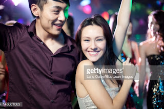
The other location was the nightclub. This was actually one of my favorite ones because I wasn't sure what to expect and how the light was going the be. Originally I was getting ready for it to be quite dark and was going to need a lot of light, but on the contrary the light that was provided was actually really good in my opinion. This light in particular is very important because it is not about being bright, but about being dark in a party environment but still being able to film and look at the characters. They have lights everywhere and the colors help quite a lot. One of the shots I tested was a CU of a person at the dance floor in a dark area, just to see how much light I was actually getting and it ended up being quite good. Here is a still of it:


Some other areas of the nightclub are more bright, specially were some of the tables are, but the lights can be switched on and off individually, which actually helps in case we need to take or add any light in specific. Another shot that I actually liked because of the contrast that I get from the light, is one looking at the bar, with the lights really low on the outside but bright on the inside. It gives a silhouette of the people on the outside, making it look more mysterious and dramatic and of course like a nightclub. Here is another still:


The only problem I would see with the nightclub is making it look like it filled with people and although the producer and the director are finding ways around it, I know based on my research from previous posts that framing it properly, usually with some close ups can make a lot of difference and give the illusion of a lot of people in a room. It is all about the way I frame it and the way it is shot and for this also using some depth of field might help, but it depends on how much of that I can achieve with the light we have and the equipment we use.

The last location we had a look at was the pitch, because it was the bigger space, the most public one and also because we have one of the dos uncontrollable elements which is natural light. I did get quite a lot of concerns but on the other hand was quite happy with some other things, but in general I think everything has a solution. One of the issues I found which I am not that worry about was the amount of light that we were getting because of the sun and how much it was constantly changing because of the clouds getting in the middle of it. At the moment although it is December, there are days when we still get a lot of sun even though is cold outside, but in February we shouldn't have that problem at all. If we happen to do, I will have to work around the light and keep constantly changing the setting on the camera to make the shots look as similar as possible of course with some color correcting help in post production. One of the other issues which was pretty similar to the last one and I also mentioned in my lighting research post, is the shadows. Due to a lot of daylight, we started to have quite a lot of shadows, specially for the drone which you can actually see in the video above. That of course looks very unprofessional but based on the first issue, if there happens to be too much light outside creating this shadows, I will have to work around the where the sun is coming from and film to the side where the shadow is hiding to avoid that problem. The grass itself is actually quite good, it look green but not in perfect conditions which helps with what he want to achieve, but it also gives me a window to play with the colors in post production like I've done for our Teaser. 

We also had our drone expert Paul Saunders for the drone shots, which actually worked quite well. We tried a lot of aerial shots which is how Danny plans to start and end the show, but also tried a tracking shot of someone playing football too see how fast it could be tracked and it actually worked quite well. There are some issues on his part of controlling the drone to do 360 degrees around a player, but that is something Danny was sorting with him personally. 


0 comments:

Pre Production - Research on Lighting for Low Budget


Another thing I decided to have a look at as part of my research, was a bit on lighting on a low budget, specially with low budget locations (real houses, rooms, halls and so on). The big difference between working on a low budget vs working with a big budget, is that a lot of the main production are mainly shot on a studio and fake rooms which makes it easier because they can adjust the light in any way they want, when in our case we can't. We don't have as much equipment as someone can get with a big budget, but that still doesn't prevent us from getting a decent lighting set with the equipment we have available. I went to have a look at the people cine light, who are really good when it comes down to lighting. I found this statement from them, that was actually very true and was the part that made me realize that a lot of people go through the same thing we do when it comes to lighting, but that it can all be fixed and worked around.

Low-budget filmmaking almost always uses existing locations – real houses, offices and so on. It’s usually much cheaper to find a workable location than to build a set. But these locations often come with a downside. They’re sometimes cramped, they may not have enough power available, and often the time schedule is limited. The budget itself presents limitations. You may not have anywhere near the number or types of lights you would need in an ideal situation. So low-budget filmmaking ends up being a compromise between numerous factors. Those that are successful at low-budget filmmaking are the people who are good at making these compromises in a way that helps to sell the scene to the viewer.

http://www.cinelight.com/low-budget-lighting/

Over the last several years, in numerous films, both low-budget and high-budget, editors and directors have a strong preference for close-ups, far more than in earlier films. Close-ups are great for low budget work; they can be shot practically everywhere. For example, you don’t need a wide shot of a fabulous ballroom filled with a hundred costumed extras to show the audience where the action takes place. Nowadays, it is quite simple to fake it with a few elements of interior decoration and sound effects, conversation or dancing, narrowing the shot to the two principals getting a refill from the punch bowl while one or two couples waltz by in front of the camera to sell the idea that there are 50 more couples in the scene.


This is actually very very helpful for us, because we do have scenes like the one in the nightclub or the community hall where the wedding party takes place, where we have to make it look there is plenty of people in there. Close Ups help a lot with this, because they can give the illusion of bigger space in a small room or with no that many people. If you manage to get 5 people in a shot from a CU, making it look busy, people with automatically assume that the rest of the room is going to be
filled with that amount of people as well. This also helps a lot with light, because it means we can get more detail light on some close ups that trying to illuminate an entire room in a wide shot. Of course this doesn't meant that we will not be shooting WS, but it means that we will keep an eye on our CU more.

I also found a lot of very useful tips and steps to follow in order to make sure I am on the right track of attempting to get the best type of light possible. This are some of those tips, followed by how it will affect my work and how it can help:

Less is more
Many scenes in films are significantly overlit, which requires lots of high-power instruments and then even more lighting for accent and highlights. Establish a low-level base fill for the room and then concentrate on lighting the actors, or the main area of action in the scene.

Less is enough
Cameras today are far more light-sensitive so don’t need the high levels of light that were once necessary. Instead of 1k or 2k you can use 300W or 800W or even less.

Less is effective
A simple lighting plan can be quite effective and uses fewer instruments. Every light you add in the scene will need another light to either even out the effect or counteract it.

Make walls interesting
Put effort into lighting accents that make walls interesting. Table lamps that cast a fan of light on the wall, light through Venetian blinds, or if the wall is fairly lit, use a cutter (black foamcore or cardboard) to cast an angled shadow in the upper corners.

Don’t be afraid of shadows
The real world is packed with shadows that make the light more interesting, so you don’t have to be afraid to let the actors to walk through shadows, just don’t have them deliver important lines there.

Make use of natural light
In some shots you can use windows and the real light coming through them for fill, key or even backlight, just by adding some diffusion or by placing reflectors in the room.

This is all very relevant to our project, because some of this are basics when it comes down to lighting, but a lot of people don't know or understand them. I didn't know too much about things like less light sometimes is more, but I do understand now that it is important to focus and just cover the part in which the action is taking place, otherwise you are wasting light on areas that you might not even be using or that are not relevant for your shot. Also that not always a lot of light means that is good, because depending on the light mood you want to create, sometimes just a bit of light is enough. This particular point affects a lot in our shoot, specially in the scene where Don gets into the backroom with the boys at the community hall, because in the actual location, the light is actually too bright for the type of mood of that scene (you can see more about this on the post related to camera test shots) and I have to find a way of reducing the light there a bit in order to achieve this, meaning that although the room actually provides with a lot of light, the actual light that we need for that scene, needs to be less. Shadows tend to be a problem sometimes, but I have been undestading with the research that they can also become part of the film as long as they don't disrupt any important scene or piece of dialogue. This will be mainly taken into account for some of the exterior parts like the football pitch, because depending on the natural light that we get we might get some big shadows or non at all. 

0 comments:

Pre Production - Camera Set-Ups

One of the other things I had a look at were my camera setups. I decided to design some floor plans with the positions of the cameras based on Danny's shot list. This would help me a lot to organize myself on the day of the shoot, so I don't have to be testing where I am going to be positioned and how I will try to get the shot he wants. Of course this will probably change in the next months or on the same shooting day if we come up with a better idea or if Danny decides to change a shot. I had a look and learned quite a lot about floor planning back in the days of our studio production, with Hans, so I went back and had a look at the set design we worked on and how he told me to make get enough coverage. Although a live production is not the same as what we doing, idea behind the floor plan and the camera positions is still the same. It is important to identify where your doors and windows are, where you can get natural light from and wether it is daytime or nighttime. I looked back at our first concept for s set design and how we got a lot of cameras but not enough coverage for it:


After having a look at it, I though that for our football shoot, which part of it is going to be a multicam shoot, it would be good to think about the coverage I can get from the same poisition of the cameras. I don't need a camera in 10 positions to get some specific shots, I just have to make sure that they have space to move if they require to and more important, that they don't get on the way of other cameras. I realised that by rotating the cameras some movements to the sides, I could get a lot of coverage and the majority of the shots with some basic three different positions and three cameras. I will be using some Go Pros as well attached to some of the players to get more action shots from their POV. 

The idea behind the camera setups was to include all of this things, based of course on Danny's shot list. I have designed the rooms as accurate as I can, adding in pencil which camera is gonna get which shot. I have used arrows to show where the cameras are going to be mainly pointing at and then some dotted lines to express movement. I have done the ones based on the locations we had at the moment, menaing some of them might change and I still need to add about 3 more that are still not secured and I haven't visited. 

Here are all the designs of them:


0 comments:

Pre Production - TV Shows Teaser Research Part III

One off the things I have been working on is the creation of the teaser for our show. It has gone through a lot of stages and finally I have edited a final piece from which I am happy in general. Taking on board a lot of the things I looked at, while doing some research, I mainly looked at the ways of making the shots quite uniques, not flat and more important finding the right tone of color to it. Originally the idea that Danny presented to me was to do something based off mystery, some sort of teaser in which the audience didn't get who or what we were exactly about until the end of it. It was a way of keeping them watching. For this I had to revisit and do a lot of research on shooting without revealing and making sure once again that the filter and tone of color iI used in the editing matched with the type of message we wanted to put up. The first thing I did was to work with Danny in the types of shots he wanted, that way I could have a bit more of a clear idea of what I was shooting. A lot of them were quite simple, but it did require a lot of work to make them look as tidy as possible.

There were 2 main things I had to work on for this teaser. The first one was the idea that Danny wanted at the end of having a 4 way split screen in which we show all the characters walking all serious until suddenly one of them drops a ball and they all laugh at him, revealing that this is not going to be a a very serious football show, but more like a couple of friends having a laugh including football in their lives. This was probably the hardest part of the teaser and more important the only one I had trouble with, because the day was really sunny and it was hard to shoot as the light kept changing because of the clouds. It was really annoying because I had to keep adjusting the aperture and making sure I had a similar light for all of them, which ended up being a bit of a problem. The 4 squares do not have the exact same light, but it was never intended to be the exact same shot, as they all they own personality, they have their own way of walk of laughing, which is clearly shown at the end of the teaser.


The second thing I had to work a lot on was color correction and altering the original footage I shot to make it look more mysterious and more commercial. The idea behind it was that the audience didn't know this was a crappy Sunday League football team, but they actually thought it is some sort of professional one, wether it is a small league or a big one. In order to achieve that, I had to make it look very professional and very good so it didn't look quite bad from the beginning. I did look at quite some different tones of colors like the one from the matrix, the ring, but in the end the one I really wanted, was a sort of green with dark that is being used for the joker in batman. The idea behind it is that the color represents the same thing that the joker does which is you can't predict what is coming. This is where I got the main idea for the color:


After a lot of work I managed to get a very similar tone like the one you see in his face, which is a type of green. I also added a bit of depth of field and shadows to make the image look less flat and highlight some light in it, like the one around the hair on his legs. Here are some stills of how it looked before and after:

Before

After

Without anything else, I leave here the final piece of the teaser:


0 comments:

Pre Production - Researching into Title Sequence Part III

After a lot of research I finally came up with a final piece for the Title Sequence. It was quite complex to do, specially when it came down to the filming, but I think it actually worked quite well. We filmed the part with Daniel (one of the actors) on one day and the other 3 on another one due to his availability, which actually worked quite well because it helped me realize exactly the way I needed to film to achieve the effect that I wanted to create. As part of my previous research I mentioned that one of the ideas I looked at, which was the biggest suggestion from Danny (the director), was Parks and Recreation title sequence, which was the base for the idea that we wanted to create. I worked around it a lot and tried to see what kind of things I could create in order to achieve a similar effect and that is when I came up with the idea of using a 3-way split screen, in which we could show 3 different aspects of the characters. One of them was going to be a shot of them doing something related to football based on the position the play, the second one was going to be something more personal related to their mood, their personality (anger, comedy, etc) and the third one is more based on a Medium Shot of each character, turning around and smiling to the camera but with a particular smile based on their personalities. I created this design to have an idea of it'll look so I could show it to Danny to make sure he liked it. The way it was going to be split was the follow:


One of the biggest problems I had during the shooting of it, was making sure I framed it properly because the space was quite limited, specially for the number 1 drop zone. That one in particular was the most annoying one because I had to make sure that the actors stayed on the left side if the camera and didn't move too much otherwise they would come off screen. I drew a line on the pitch just so they knew what was their safe box and that helped a lot during the editing. The shot of Malik running with a celebration was actually quite fun to do, because I had to follow him zoomed in as much as I could keeping him in the middle of the frame. The shot in which Jamie is singing, was shot from a mirror, as a metaphor of showing the reflection of the type of guy he really is. 

I also had a look at some of the types of fonts I could use for the titles, which was also too keep as part of the branding of the show and I found this really good one called epidemia, which fits really good because it has a filling that looks like the white line that is painted on the grass.


Here is finally the title sequence: 


0 comments:

Pre Production - Final Poster

As part of the things I was meant to do, I was to come with an idea for a poster and work around it. After working on various different designs I came up with this concept, which is based on showing the different types of personalities of the main characters and some that compliment them and also getting bit of a notion of the mood of the show. This was my draft result:


After showing it to my teacher and also looking at it back again, he mentioned me to add something related to football because it doesn't look as much like a football show. I decided to go back to it add some really nice touch ups for the background and also work a bit more on the branding which is why I changed the font of it to our actual Sunday League font, making sure we keep the branding all along. This is the final result:


0 comments:

Pre Production - Cinematographer VS DOP (What's The Difference)


I did a lot of research on wether there was a difference between a cinematographer and a Director of Photography and in the end although a lot of people and experts haver their own way of seeing it, it is exactly the same thing, its just a matter of how you like to be called. I myself rather be called Cinematographer, because for some reason I used to think that DOP was more associate with actually taking pictures which is not really my thing. I think from that moment on I decided I just wanted to be called like that. There is no big reason behind it, there is no difference is just a matter of choice. I found this really nice statement from Director and Cinematographer Jon Swindall from Swindyfilms, which I thought I would leave here in case anyone wants to do a reflection on it.

So what's the difference between Cinematographer and Director of Photography?
I get this question quite often and it's a good  one.  I prefer to be called a cinematographer because that's what I think of myself as being.  But - I know the shorthand of being called a "DP" is ubiquitous in the commercial world.  Who is the DP?  Who's the best DP?  I think we like to shorten things and abbreviate in this day and age so I see the "DP" nomenclature gaining steam.  
Sometimes - I feel a little pretentious calling myself a cinemtographer but then that's what I think of my self as -  I am a recorder of cinema.  I use the tools in my toolbox to paint with the light, and position and move the camera to further the story and create something beautiful.  A recorder of movements - thank you Wikipedia - 
Cinematography (from Greekκίνημαkinema "movements" and γράφεινgraphein "to record")
The ASC, the American Soceity of Cinematographers, from the article Hora, JohnThe American Cinematographer Manual (9 ed.) .defines the role of cinematography as 
"a creative and interpretive process that culminates in the authorship of an original work of art rather than the simple recording of a physical event. Cinematography is not a subcategory of photography. Rather, photography is but one craft that the cinematographer uses in addition to other physical, organizational, managerial, interpretive and image-manipulating techniques to effect one coherent process."
Also - Roger Deakins, a personal hero, has this to say about it "when it comes to narrative storytelling I personally prefer to be credited as a Cinematographer. I always saw the relationship between a Director and cameraman as mutual combination of ideas and decisions that overall move the story forward and give the look and feel of a picture. I have worked with plenty of Directors and I'm sure you have done the same that have had an idea of the framing they were looking for when the shot was being set up...or why would there be directors viewfinders? I told him I thought a DP was someone who actually had entire control over how a subject was lit as well as being shot i.e interviews and documentary work.

0 comments:

Pre Production - Researching Low Budget Cinematographer Keiki-Alexandra Bailey

Keiki was actually one of the most helpful ones I found, because she goes quite in depth with some of the basic things that you need to know as a cinematographer and how mastering this things can make your film better without too much effort. Keki is an independent cinematographer and she offers her services as a freelancer to shoot films. One of the things she does a lot is tutorials and helps with some feedback from her previous shots. She has never shot with a big budget and it has always been with very low one or even none at all. Her company name is 646 Studios which is online only and it's where she posts everything she does. I will be posting some of the tips she talks about, add a bit of my thoughts and how will this affect or help my work. The idea behind these tips she gives are for aspiring Cinematographers and Camera Operators that have no access to professional cameras. rigs, or lighting and want to look boost their work to a higher standard not unlike actual film. Please note that I'd have been practicing for few years now and have studied a tons of film and television to further my knowledge.

For Tip #1 is Know your shots


There are many different shots that are used to reinforce narrative, dialogue and editing structure. There are no rules in general about where you place the camera but however, it is advised you stick to the conventions of genre unless it is an experimental piece and always have the edit in mind

Master 

Also known as the wide/establishing shot. The subject is full in frame and the location fills more space. This shot is used for exposition and keeping the audience aware of where the character is. It is usually used to book end a scene but can be used anywhere especially if the film is epic in scale.

Mid Shot 

As the name suggests, a shot where the subject is seen at mid-level. This is a good way of starting a dialogue scene and is useful if body language is involved.

Close Up

A shot for dramatic emphasis. The audience can see every twitch, shift in the eye movement and wave of emotion that the character feels.

Extreme Close Up

Great for building tension. Should be used sparingly as it narrows the audience's view of the subject and cuts off all else.

Flexi Shot

A shot that changes scale and composition through movement of the subject/camera.


Tip #2 is Negative Space

This is the fundamental difference between amateur and professional cinematography. Rarely, if ever, should you place the subject at the center of the frame. Negative space either side allows positioning of other subjects/objects and gives the image a much more artistic appearance.

Tip #3 is Forced Perspective

A technique that's stood the test of time but is now even more accessible thanks to the digital era. On a basic level, forcing perspective refers to the use of foreground/background in such a way that reinforce depth. But with the use of digital edit software, one can also now completely change the composition after it has been shot.

Tip #4 is Lighting

There are limits to what you can achieve with natural/ambient lighting. But this doesn't mean you can't achieve a great look. Choose your locations wisely and remember the rules of light and shadow. Front lighting will dim the background, back lighting will dim the foreground. Side lighting will cast varying shadows across the frame.

Tip #5 is Coverage

As mentioned earlier, the edit should always be in mind when shooting so that the shots flow together seamlessly. Shoot far more footage than needed to be sure you have options and cover all the bases. Shoot from every angle you can think of no matter how long it takes.

Tip #6 is Experiment

Have fun! Don't be afraid to place the camera in what others may think to be stupid places or locations. Mix up visual styles to keep in fresh and play with the camera settings and light to create something amazing.


All this tips are very helpful, because although the majority of them are quite simple things to keep in mind, they can make everything easier and save a lot of time. I plan on using this a lot, one by one to make sure that my shooting goes down well. First I have to make sure I know exactly what each type of shots mean, not just knowing a close up (CU) is framed really close to whatever you are shooting, but the type of things that a close up mean to the audience. We have a lot of different shots and different moods for each character during the whole episode, which is why I have to make sure I know what the shots mean in order to help the director get the emotion he wants to achieve. The second point about space is another big factor for us, because a lot of our locations that include rooms, living rooms and kitchens, are not very spaceful, which means I have to find a way around to make sure it still looks good. For this I will be working with some wide lenses and also thinking how can I rearrange some things in the room to make it look bigger or give me more space to film. The third point will help a lot to manage to get some good depth of field, with the use of the background and some light, which will help achieve more by adding more relevant elements to the drama and making my shots look more professional. The fourth one which is light is probably one of the most important ones, taking into account that in February there might not be too much light outside and might also need some extra on inside locations as well. I will be using everything I have available to get as much as light as possible, but based on another research I will be posting about light, sometimes too much light is not good. The last two points can be combined into one which is a bit of experimental coverage. Sometimes shots from weird angles are very innovative and can give the audience a different perspective of situation, but they could also be misused if you don't know exactly what you are trying to achieve which each one of your shots. In order to make this better, I will be trying same scenes from different shots and with the help of my director, I will be looking at some different ways of experimenting with angles.

2 comments:

Pre Production - Researching Low Budget Cinematographer Andrew Rivara


Another one of the things I decided to look at after some feedback from my teacher, was some statements, tips and having a look at some work from cinematographers that have been working on a low budget since I will be as well. While I was doing some research on the Drinking Games short I refer to on my previous post, I found a lot of work from this guy Andrew "Tank" Rivara, who has been working on some low budget films and in my opinion has actually done quite some good work for the tools he had available. This is a list on IMDb where it shows the work he has done:

http://www.imdb.com/name/nm2565448/

Among some of the other things that I found about him, were some really useful tips that he posted on filming with no budget and no space. I thought that this statement was actually quite useful, specially due to the fact that we will be working without much budget and also without as much space in some scenes. The statement is based on the work he did on Drinking Games, which I have seen and in my opinion is a very decent piece of work for the budget they had and I also think that after seeing some of the struggles the had during the filming of it, the way the Andrew dealt with some of this as quite amazing. A lot of this problems are mentioned on my posts about tips on being a cinematographer if you are interested in reading about them. This is the statement he put:


"I mainly used the desk lamps that were in the room because we didn't have the time to move around a fresnel unit, not to mention the space and heat issues. We controlled the desk lamps with lighter diffusion grades and black wrap, and all practicals were hooked up to dimmers. We swapped out bulbs regularly. Notably, we used clear glass bulbs for Noopie driven scenes later in the film to get harsher key lights. Sometimes this came out a touch uglier, but these bulbs felt right. We rewired the top fluorescent fixtures and rigged up a China ball that we jammed into the ceiling panelling, which was then controlled by the switch on the wall that actors could control. This was our main ambient light for the beginning of the film. We grip armed in 10'-18' China balls often, including a red polka dot one from Pier 1 that gave us a heavily saturated red fill light. We used small bounce and neg fill items often. Another interesting lighting issue was keeping out the daylight from our window, but still slow for Noopie to throw the phone out this window. All dorm room scenes were shot during the daytime, so this was a problem. Fortunately, the dorm room was located on the first floor, so we chose to build an 8'x8'x8' duvetyne box outside the window so that Rob could interact with it."

http://nofilmschool.com/u/ryangielen

This gives me a very good perspective of the possible things that I could be using for the show during some scenes, specially when struggling with space and to light the room a bit more. I have to consider more than anything everything that is in the room and how can that help me to get a better shot, whether its natural light, lamps, a little light from a toy, etc. If you are interested in watching more of his work, you can have a look at his showreel on Vimeo:


Andrew Tank Rivara DP Reel from Andrew Tank Rivara on Vimeo.

1 comments:

Pre Production - Camera Techniques To Tell a Story Part II

This is a continuation of Camera Techniques To Tell a Story Part I. If you haven't read it, you can do so by following this link:


The fifth video is Fucking With Physics:


Although this tip can be used in a different amount of situations, it is a very important one because it allows to give your shots different perspectives and make them get a bit more involved with characters with just some simple moves. There are two main types of techniques that are applied here but the based for all of them is the same which is what really matters in the end. The first one that is mentioned is a spin out. This one is a movement that will help defy physics and help the audience get a different perspective. In this case there is a person laying down in bed and we see a shot of him on one side of him, but he seems troubled, he seems like s a lot is going on on his mind and this is where the shot comes in place, which is a spin towards the right, giving the illusion that the room is getting upside down, which helps to establish then away in which his mind is at the moment, which is rotating and very confused for whatever reason. The other example shown here is very similar to the second video in which gives techniques to introduce characters, but this one is a bit more focused towards breaking the physics of a room. Once again the idea is to start the camera at a specific level from the ground and change it as you are slowly zooming in or dollying in. This adds a bit for drama with the zoom in but also changes the perspective of whatever the person is going through at the moment because we see how in an instant the person is growing up into something either good or bad. All these types of shots are very useful as well taking into account that there is a lot of drama and character grown in our show, so I will be taking into account some shots in which I could use the physics to imply a the mood of someone or link it with something that is going on.

The sixth video is Enhancing Conflict:


For this video in particular there is just one small part that I found really useful and that is the reason while I will be a bit more briefly on this one, because although it was quite a short video itself, only one element from it actually worked for my research. One of the things that is mentioned is how the position of the camera can give the illusion of having more or less space that you really have and how where you place it alongside with the way you move it, can give some very make the audience engage a bit more on a scene, even though you feel you don't have enough space to do it. Space is very important when it comes down to actually shooting because sometimes you have a small space and you need to make it look bigger or you don't have too many actors and you want to make it look like you do. This is a great example I can use during the nightclub scene, because I have to make it look like there is quite a lot of people and that it doesn't look very empty. The way some dialogues and conflicts are shot in the video using a spin camera movement are actually very smart and that is something I am going to keep into account for our shoot because it gives a really nice effect specially when dealing with a small cast.

The seventh video is Breaking the Fourth Wall


Just like last video this is a very particular one that mainly brings one thing that could potentially be used in our show mainly in one scene. It is mentioned about the idea of breaking the 4th wall in order to get into someones mind. In this case you can see a girl standing at the end of a hallway in which is snowing. The first element that people automatically are meant to think about is how is it possible that it snows inside a room and that is when you start getting the perspective that you are inside her mind. She talks directly to the camera as it dollys in from one side of the hallway to the other where she is standing and it gives a very different perspective of what troubles her mind, because instead of telling the story to someone, she could be imagining this. I thought this could be a good idea for when Don has a minute with himself to think about coaching this guys and reflecting on his past about it, but it will depend whether a type of shot like that will fit with the show or not, but I believe that it could potentially be and idea. 


0 comments:

Pre Production - Camera Techniques To Tell a Story Part I


I have recently been studying more into how to tell a story with a camera, because I have been wanting to understand more how the way of shooting can change a lot the way characters are introduced, story is being told, how color sets the mood of a character and some other useful techniques I will be talking about in the next two posts. I have looked into this company called Believe Limited, who create low budget films with not expensive gear and light, but that still looks great. They have been very kind to post 9 amazing tips for cinematographers and directors on some very useful techniques that can be used with the camera to tell a story without the need of dialogue. I have picked 8 of them which have been the most useful ones (spinning shots being the one I won't be using). In this post I will be talking about the first 4 of them and how they relate to our show based on the things I could do with the camera to put them into practice.

The first one is Slow Dolly:


In this video, it is explained how camera movement inflicts a lot on introducing a character, not only visually but also their personality. Three different examples are used here based on the low budget drama that they created called "Drinking Games." The first one which is really helpful is how the type of shot can imply whether a character is a main one or ot. In their example they show a character coming out of a balcony in a Wide Shot (WS) with a slow dolly, looking to the day like a king as if he had no worries at all, while his friends are waiting for him downstairs in a car. This helps to set the type of person he could potentially be and how he sees the world as well. A Close Up (CU) or a Medium Shot (MS) would have not shown the same message, because the audience probably were not going to be able to see on the same shot that he was coming out of a big house balcony and that there was a car outside making noises wating for this guy to come down. The second example is with the use of color and how it can set the mood and the tone of a character in a scene. They use the example of a light red with orange on the bed so it blend pretty well with a shirtless man showing a very unhappy expression on the day of his birthday even though his gay boyfriend is bringin him a cupcakewith some candles. The last one is the use of a slow dolly in a veyr small space, to add drama to what a character is saying. If the shot was just static, people would be too focused on what he is saying, but since the shot is slowing dollying in, although what he says could be important, the shot itself is already adding some sort of drama on its own without the need of dialogue. This helps as part of my research for the our show, because I have all three different examples that can potentially be used in the show. We have 4 very different main characters that need introduction in a way. Different types of mood they face during the pilot episode and last but not least, very dramatic scenes in which I could use this slow dolly technique to add a bit more of drama and suspense.

The second one is Introducing Characters:


Although this tip is very similar to the previous one, this one is not based on only using slow dolly to introduce characters or set personalities of them. This tip is very straight forward with one example that is actually very helpful for everyone that is trying to think of an idea of introducing a character with a very particular personality. In this case they show a guy previously introduced already in a room, who seems to be watching someone underneath a blanket. We get the sense of being watched because you can see a shot of the person underneath blanket with showing only but half of his hand with a watch, making it look like someone is down there possibly alive or dead but very mysterious without the use of any dialogue. After the guy leaves the room, we see a shot of this blanket in the middle and the camera starts at a high ground and as this person under the blanket starts to stand up without reviling himself, the camera starts going to a lower ground, implying that this character has some sort of powerful or frightening personality, creating the illusion that the camera is another person inside the room. This is a very useful trick that can be used in any sort of situations where you need to establish someones authority because we have to remember that the audience is the one watching and the angles in which you shoot are going to be the ones in which the audience watches the film and that is how you can create the effect of making it look like the camera has converted into a person. For this particular style, I think it will be very useful to use it in situations like the scene of Don talking to the boys about not being interest of coaching them, like he has some sort of authority and also when Nathan is trying to train not to be as weak as he is, making him look even more weak with some good camera angles.

The third one is Marrying Set Design w/ Shot Framing:


The next one is more focused on set design and framing it. Although almost half of the video is more focused towards the director, explaining how they are meant to incorporate the set design with they shots, there is a very interesting point when it comes down to framing the shot working along with your director, which is the part that interest me. On the scene show in the video, we can see a guy and a girl having some sort of private moment in which they seem to be talking about something very serious. The whole idea of the set design in this part, was that the cinematographer was able to get frame the shots to he could get a creepy butterfly tapestry that is having of the wall in the room. The concept behind it is that although there isn't much dialogue and although you watch the actually drama you won't understand exactly what is going on, even that way you can still tell that this two characters are discussing something important to them, but the idea is that having the tapestry in every single shot one, not mattering how blurry it is, it represents something dark and not good, which is in fact what this guy is going through. The tapestry has very dark colors and the butterfly is meant to be a metaphor, so it is important to think of the set design when getting things into frame and see what each of them could imply to the audience. This is a very helpful tip as well for out show, because we have a lot of scenes in rooms where we can decorate them and manage to get this effect. Although this is more useful for the director, it is still important to me because if the director includes something and maybe is not aware of what is is causing in the shot, I need to be prepared to analyze my own shot and explain to him the message that I can see though the lens.

The fourth one is How to Use Whip Pans:


This other one talks about the use of whip pans and the pace on movement of the camera. First if you haven't watched the video, I recommend it to understand more what a whip pan is, which is mainly a very quick pan between characters or object, usually shot in a small space around a MS. In this case the whip pan is very well done and it fits perfectly with what is going on in the scene. What we see at the beginning is a guy that is looking for something, while we it keeps panning between him and some of the other characters that are staring in the room. The whole idea of this movement in this shot is that the audience gets more involved with what is going through their heads and the adrenaline that the are feeling when the are about to have some cocaine. The idea is that with this shot once again without the need of focusing too much on the dialogue, the audience can see how big of a deal this is for some of there characters in the room. The whip pan works as some sort of person quickly moving between characters to establish the pace in which their hearts are beatings, which is pretty fast. If the scene would have been the same but some really slow camera movements, it wouldn't have created the same sensation of rush that the characters are feeling at that moment. I think that this is a very useful trick specially when it comes down to crucial moments and some important actions, because you are using the camera to set the pace of the scene without the need of dialogue. It helps a lot in our show as well, wether it is on discussions between characters or some action during the football scenes, because once again the whip pan helps to set the pace. 

0 comments:

Pre Production - TV Shows Teaser Research Part II (Low Budget Comparison)

One of the things I decided to look at was the difference between creating a low budget teaser and one with a good budget. Since teasers are not as common as trailers, specially for low budget, I decided to give a bit more of a in deep look to see if I could get a comparison between both and understand what are the kind of things that make them unique, whether it is the VFX, sound, dialogue, drama or what exactly. I found a great example that actually made taught me a lot and was great part of my research because it is a kind of comparison that is not made very often and can help to look at things that looking at individual teasers or trailer doesn't. This is a low budget trailer created by a group called Dumb Drum, who are just a group of 4 people that make funny videos. The following is an exact replica of one of the Star Wars The Force Awaken Trailer, but created fully in low budget. Although I am not filming a sci-fi, I am working on a low budget and I want to see and compare what really makes a teaser and I believe that having a look at this comparison and analyzing it based on my research, will give me a more clear idea of the kind of stuff I need to be having look at. Let's start with the low budget trailer:

                                        Low Budget


Big Budget


Watching at this trailer after having watched the original one dozens of times is very interesting because it allows me to see what kind of things are crucial in the making of a good teaser/trailer. As part of my research I found this statement from a reality TV Show editor that speaks about the purpose of a teaser, whether it is low budget or not. 

Your Teaser needs to be edited in such a way that it gives an Executive time to get settled AFTER they’ve pressed play.

When that viewing is done it needs to answer one question:
“What is your show about?”
http://iwanttomakeatvshow.com/teaser-tip/
Based on this statement, I have decided to breakdown the different elements of this trailer and compare it to the original one to see what are the key points about it and how will this affect the shooting and editing of our teaser.

Story
Story has always been a very important part of any show, because its the heart of it, it's where everything begins. In this case, the script and the story of the trailer remains the same, which still helps to give a sense of what this new film is going to be about and how it helps to put all the images together, making sense to what is coming. Although in a teaser there isn't that much of a story, it is still very important that the essence of the show is kept and the audience gets a glimpse on what it is about, which is once again based on the statement mentioned above. 

Visual Effects
This has become with time another very important factor, specially for Sci-Fi movies and actions ones, because a lot of people these days like to see a lot of "lights" and "shiny" things on the screen like lasers, fire, magic, spaceships, etc. Technology has made all this possible and that is why a lot of movies and TV Shows these days use a lot of special effects to make them more realistic. In this particular case, the effects are needed because it is a movie about lightsabers, spaceships and a lot on futuristic universe. Although the low budget trailer tries its best to replace those scenes, in my opinion it does quite well, because it still keeps the essence of the movie by keeping the rest of the elements intact. I believe this particular case helps in our teaser, because we are creating a show with not many visual effects, its all real and this allows to understand how without any big effects, you can still achieve something meaningful.

Music 
Like any production, sound and music play a very important role because its sets the tone of any scene. Although our show doesn't include a big amount of sound effects or music, it still needs to create a sound concept in which allows the viewers to identify the show with the music. Like in this case, although the music they have used has been all recorded with voice sounds, the melody is the same as the original star wars one, meaning that no matter how you listen to it, everyone that has seen Star Wars before will automatically associate it with the film. What I want to make sure as well in the edit of our teaser is that the main theme for our show is included, so that anyone that watches it starts already to get identified with it and associate it. We have picked a song that is not really well known and that suits perfectly with our show in my opinion and this will allows even more to achieve this, since people don't have it associated with anything so far. 

Camera Shots/Light
This is very likely one of the most important elements as well because poor light and wrong shots can ruin completely the type of message that you want to create. I will start comparing the low budget trailer first, implying that the camera shots are pretty much the same as the original one which still keeps that dramatic impact that is trying to make, but the light is very different than the original one due to not being very realistic, which makes the quality of it go down quite a bit. The fact that you are shooting in low budget doesn't meant that your light and everything else has to be bad, you can still create great visuals with proper use of light and color during the shoot and/or in post production. In our case we shot a teaser first that had very poor lighting and made the film look very flat and boring. We were trying to achieve a bit more of a mysterious look with some darkness in the room, but due to poor light this effects wasn't created properly which is what took us to re shoot our teaser. I am happy that that happened, because I learned a lot from it going back and doing more research about shooting and I learned from my mistake. 

Finally I will leave here a live comparison of both the trailers in case anyone is interested in watching them both at the same time and compare them themselves:  

0 comments:

Pre Production - TV Shows Teaser Research Part I

As a cinematographer and an editor for the Sunday League pilot, I have been given the task of filming and editing a teaser for the show. The first thing I decided to look at what the difference between a teaser and a trailer, taking into account that I am planning on doing a trailer later after shooting some scenes in February. From the beginning I have had an idea of what a teaser is compared to what a trailer is, which is a short version that actually teases the show in a way that doesn't give much up. A trailer editor in Hollywood called Kuldeep Shah, explains a bit more the difference between them two. She says:


A Teaser is exactly what it's called..It's main purpose is to just tease the audience. They're usually around a minute (give or take a few) and have minimal visuals, dialogues lines without giving away too much of the movie. Teasers work well to build up anticipation.

Trailers are more fleshed out. They have a story line, or a message to communicate. They're longer..around 2 - 2 1/2 mins long (approx). They'll have more dialogues and sometimes narration to reveal more story of the movie. 


https://www.quora.com/Teaser-vs-Trailer-vs-Preview-whats-the-difference


A big part of this research was to understand how teasers worked and their difference between TV and film teasers. The majority of people usually watch film teasers on the cinema and social media, but it is very unusual to see actual TV shows teasers unless you watch them on TV or on social media as well, which are not as common as trailers. I had look at some in the past but I decided to give more of a look to some recent ones and understand a bit more of what are the type of elements that teasers include. Although they are different productions, they all include similar backgrounds which as Kuldeep Shah was explaining, is to not include much dialogue or story, and sometimes they don't even have to reveal anything from the story, its usually teasing characters, tone or drama. I had a look at a couple of them that could help me think of techniques form the editing and shooting point of view:


Scream Queens


This teaser is one of my favorites and helped me inspire a bit on finding a tone to our teaser. It shows a character, who seems very girly, probably with money, but a very bitchy attitude. On top of it the music and the blood that comes out of the chewing gum, gives it a bit more of suspense and shows that there will possibly be murders and big suspense in this show. I thought this would help in ours to keep in mind the kind elements I have to pay attention to and include in shots and in post production to makes sure I am setting up the right tone with the right colors and shots.


Heroes Reborn


On this teaser I looked at some other elements based on Danny's (the director) first idea of a teaser which was to tease the characters. This particular one is from Heroes Reborn, teasing one of the new characters called Tommy. Although the teaser is 15 seconds long, it does show and tell enough to tease someone. There is dialogue in this one in which he briefly says he is running from someone, people think he is dangerous and with some visuals this helps to see that he has some sort of powers and people are coming for him. That tells enough to know more or less what this show is going to be about. On top of that the use of color is very important in this type of teasers because it represents the character, in this case green. Some other characters form the same series are represented with a different color. This could have been a good idea implement if we were going to tease the characters instead of the show, but in the end we didn't.


Blood on the Ice


Next one is a really low budget teaser for a Film and TV course, which helped me realize that you don't need big shots or scenes or just to include too much to transmit a message. The teaser is not the best, but in my opinion it does include some elements that are good. First the whole film is based on people that get killed on a mountain full of snow. In the teaser you can see how it is snowing, the music and the filter on the walking between the trees helps to ogive some suspense of expecting something to happen. Some elements like maybe blood on the floor or a scream or something similar would have make it better, but I wanted to use this one more from the editing point of view to see how with some good music, filters and titles, I can easily set the tone of my show without focusing as much on the actual shots.


House of Anubis


I also decided to have a look at this British show, House of Anubis, which used to air on Nickelodeon, but wasn't filmed on big budget. The teaser uses a lot of filters to represent tones and mood. We see a lot of yellow at the beginning, brown down at the cellar and a bit more black and blue somewhere below the cellar. The teaser ones again has no lines and doesn't have any effects or anything big, is just a couple of main shots giving drama and suspense, showing that something is hidden and a secret is being kept and that these people we see are looking for something or someone. With that said, it helps once again with our side because what we want is just to tease what our show is about without really giving much away, but also including some of the main elements.


Any Time Robbery


Another low budget teaser that I decided to include not because of the good aspects but because of the bad ones. Although it is low budget, this teaser is really not very well shot and edited and it doesn't really give anything to hold on to. Although there is no dialogue or anything, we see a kid in like western school clothes walking on mini forest with a lot of suspense music, but it is really not giving away anything. I didn't get what this was about, I actually watched the short film and it was even worse than the teaser, but I would have never guessed it was all about this guy getting robbed in the forest some money he took from the cashpoint. I learned from this one that although teasers can be l ow budget they don't necessarily have to be this bad and that if I don't include the important elements mentioned in the ones before, it will end up making no sense like this one. 

0 comments: